Create Beautiful Hand-Drawn Style Charts with the Handwritten Graph Library
Ever wished your charts looked less “perfect” and more like they were sketched by hand? The Handwritten Graph npm Library (written in TypeScript with types support) brings that informal, playful aesthetic to your data visualizations, ideal for your personal websites, educational data plots, presentations, or any time you want to break away from the rigid, mechanical feel of traditional charts. In this post, we’ll walk through what the library does, how to install it, with a quick code example so you can start drawing hand-drawn style graphs in minutes.
Why Handwritten Graphs?
Most charting libraries strive for pixel-perfect precision with straight lines, exact colors, crisp edges. That may great for corporate dashboards, but sometimes we want something more human, less ‘engineered’ and more ‘sketched’. Javascript version of this chart library initially created to be used in an educational curriculum website to give that natural feeling to our youngsters.
Hand-drawn graphs can:
- Grab attention. A chart with irregular strokes stands out in a sea of rigid, geometric visuals.
- Convey approachability. When you are explaining a concept (especially in tutorials or personal blog posts), an informal look can feel friendlier and natural.
- Highlight uncertainty. Those jitters and slightly off-kilter line segments can subtly reinforce that data is not always exact.
The Handwritten Graph Library builds on top of SVG (and, under the hood, utilising D3 library) to introduce random jitter, “scribble” fills, and painterly effects. So your graphs may feel like they were drawn with pen and watercolor, not generated by a computer.
Key Features
Irregular Line Strokes (Jitter). Lines are not perfectly straight. Each segment wiggles slightly to mimic a human drawing. You can control how much jitter is applied.
Paint-Like Color Fills. Instead of flat, uniform colors, areas (e.g., under a curve) use overlapping “blobs” of semi-transparent color for a watercolor effect to create natural feel.
Customizable Styles You do not need to stuck with defaults. Tweak stroke thickness, color palettes, jitter amount, and randomness to match your own hand-drawn style.
Lightweight, TypeScript-First Fully written in TypeScript—typed API, tree-shakable, and easy to integrate into modern build pipelines (Webpack, Rollup, Vite, etc.).
Simple API Just pass in your data points and a few configuration options; the library handles generating SVG paths, patterns, and jitter.
Getting Started
Below is a quick guide to installing the library and rendering your first hand-drawn style line chart.
Install via npm or Yarn
1
2
3
4
5
# npm
npm install handwritten-graph

# or Yarn
yarn add handwritten-graph
Include a Container in Your HTML
1
<div id="chart-container"></div>
Basic JavaScript/TypeScript Setup
1
2
3
4
5
6
7
8
9
10
11
12
13
14
15
16
17
18
19
20
21
22
23
24
25
26
import { createGraph, LineChartData, LineChartConfig } from 'handwritten-graph';

// 1) Prepare your data in the correct format
const data: LineChartData = {
  labels: ['0', '1', '2', '3', '4', '5'],
  datasets: [{
    label: 'Sample Data',
    data: [10, 25, 18, 30, 22, 35],
    lineColor: '#E63946'
  }]
};

// 2) Define configuration for "hand-drawn" styling
const config: Partial<LineChartConfig> = {
  width: 800,
  height: 400,
  handDrawnEffect: true,        // Enable hand-drawn style
  handDrawnJitter: 1.5,         // How "wiggly" the line is (in pixels)
  showArea: true,               // Fill the area under the line
  useScribbleFill: true,        // Use watercolor-style fills
  fillStyle: 'directional',     // Type of scribble fill
  pointRadius: 3                // Size of data points
};

// 3) Create the chart
const cleanup = createGraph('#chart-container', data, config);
Build & Serve Configure your usual bundler (e.g., Vite, Webpack) to compile and serve the above
index.ts. Once your page loads, you will see a line chart that looks hand-sketched—with slightly irregular strokes and, if you enabledshowArea, a soft watercolor-style fill under the line.
Code Example: A Full Minimal HTML Demo
Below is a self-contained example you can drop into a simple static site setup. It will produce a hand-drawn style line chart of sine waves.
1
2
3
4
5
6
7
8
9
10
11
12
13
14
15
16
17
18
19
20
21
22
23
24
25
26
27
28
29
30
31
32
33
34
35
36
37
38
39
40
41
42
43
44
45
46
47
48
49
50
51
52
53
54
55
56
57
58
59
60
61
62
63
64
65
66
<!DOCTYPE html>
<html lang="en">
  <head>
    <meta charset="UTF-8" />
    <title>Handwritten Graph Demo</title>
    <style>
      body {
        font-family: sans-serif;
        margin: 2rem;
        background-color: #f9f9f9;
      }
      #chart-container {
        background: white;
        border: 1px solid #ddd;
        padding: 1rem;
        box-shadow: 0 2px 4px rgba(0, 0, 0, 0.1);
      }
    </style>
  </head>
  <body>
    <h1>Handwritten Graph Library Demo</h1>
    <p>
      A simple sine wave chart rendered with hand-drawn jitter and watercolor
      fills.
    </p>
    <div id="chart-container"></div>

    <!-- Load dependencies -->
    <script src="https://unpkg.com/d3@7/dist/d3.min.js"></script>
    <script src="https://unpkg.com/handwritten-graph@latest/dist/handwritten-graph.js"></script>

    <script>
      // Generate sample sine wave data
      const data = Array.from({ length: 25 }, (_, i) => {
        const x = i / 2;
        return Math.sin(x) * 5 + 12; // center around y=12
      });

      const labels = Array.from({ length: 25 }, (_, i) => (i / 2).toFixed(1));

      const chartData = {
        labels,
        datasets: [
          {
            label: "Sine Wave",
            data,
            lineColor: "#1D3557",
          },
        ],
      };

      const config = {
        width: 800,
        height: 400,
        handDrawnEffect: true,
        handDrawnJitter: 2,
        showArea: true,
        useScribbleFill: true,
        fillStyle: "directional",
        pointRadius: 3,
      };

      HandwrittenGraph.createGraph("#chart-container", chartData, config);
    </script>
  </body>
</html>
What is actually happening here?
- We generate 25 points along a sine curve, then shift/scale the y-values.
- We set
handDrawnJitter: 2so that each segment of the line wiggles up to ±2px. - Because
showAreaistrue, the library creates a semi-transparent “watercolor” pattern under the main line—built by layering scribble patterns withuseScribbleFill.
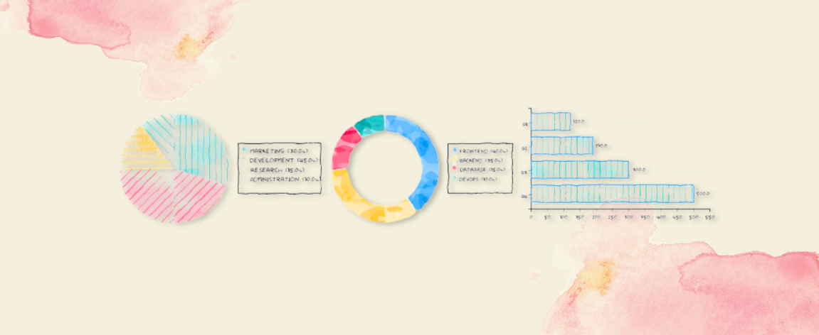
Chart Types Available
The library supports multiple chart types:
Line Charts - Perfect for showing trends over time
1
createGraph('#container', data, config);
Bar Charts - Great for comparing categories
1
createBarChart('#container', data, config);
Pie Charts - Ideal for showing proportions
1
createPieChart('#container', data, config);
Each chart type supports the same hand-drawn effects and watercolor fills.
Customizing the Hand-Drawn Look
Below are the key configuration options you can tweak:
| Option | What It Does | Example Effect |
|---|---|---|
handDrawnEffect | Enable/disable the hand-drawn style | true = sketchy lines, false = perfect lines |
handDrawnJitter | Maximum pixel offset for random jitter | Higher values = more “sketchy” |
showArea | Boolean: whether to fill the area under your line | Set to false to remove all fills |
useScribbleFill | Use watercolor-style scribble patterns | true = painterly fills, false = solid colors |
fillStyle | Type of scribble pattern | 'directional' or 'oilpaint' |
lineColor | Line color (specified in dataset) | Change from dark blue to bright red |
pointRadius | Size of data points | Larger values = more prominent dots |
gridColor | Grid color of the chart | Change grid appearance |
Color Configuration
Line colors are specified in the dataset:
1
2
3
4
5
6
7
8
const data = {
  labels: ['A', 'B', 'C'],
  datasets: [{
    label: 'Series 1',
    data: [10, 20, 30],
    lineColor: '#e74c3c'  // Specify color here
  }]
};
You can also combine multiple line series by adding more datasets to compare trends with different colors and styles.
Potential Use Cases
Technical Blog Posts & Tutorials Show data trends in a more engaging, hand-sketched style—great if your blog already has a “note-taking” or “whiteboard” aesthetic.
Slide Decks & Presentations Replace standard corporate charts with a playful, organic look to keep your audience’s attention. Perfect for conference talks or internal “lunch & learn” sessions.
Prototypes & Sketches Create rough visual prototypes that emphasize “concept” over “precision.” Sketchy charts communicate “early stage” or “draft” ideas (the same way you love the balsamiq wireframes).
Educational Tools When teaching statistics, data analysis, or math, a handwritten look can help students feel like drawings are natural and things live on the board.
Reports with a Personal Touch If you write internal memos or small analytical reports and want to break the monotony, sprinkling in a hand-drawn graph can add personality.
Getting the Most out of It
Combine with D3 or Other SVG Workflows Since the library outputs standard SVG elements and patterns, you can still use D3 for scales, axes, and animations. The library is built on top of D3, so it integrates seamlessly.
Multiple Chart Types Don’t limit yourself to line charts. Bar charts, pie charts, and area charts can all be “sketched.” The same jitter and watercolor-blob logic applies across all chart types.
Use Custom Fonts Pair your sketches with a handwriting font (e.g., “Architect’s Daughter” or “Shadows Into Light”) so any text, titles, or axis labels look more cohesive with the hand-drawn aesthetic. The library uses ‘Humor Sans’ as default.
Responsive Design Set appropriate width and height values in your config, or use CSS to make charts responsive to different screen sizes.
CDN Usage
For quick prototyping or when you don’t want to set up a build process, you can use the library directly from CDN:
1
2
3
4
5
6
7
8
<!-- Load dependencies -->
<script src="https://unpkg.com/d3@7/dist/d3.min.js"></script>
<script src="https://unpkg.com/handwritten-graph@latest/dist/handwritten-graph.js"></script>

<script>
  // Use the global HandwrittenGraph object
  HandwrittenGraph.createGraph('#chart', data, config);
</script>
Note that D3.js is required as a dependency when using the CDN version.
Further Reading & Repository
The Handwritten Graph Library is open source. You can explore the full API, report issues, or contribute directly on GitHub:
👉 handwritten-graph-ts on GitHub
Inside the repo, you will find:
- Examples folder with live demos of line, area, and scatter charts.
- API documentation describing all configuration options.
- Unit tests demonstrating edge cases (e.g., very sparse data, large jitter amplitudes, etc.).
In addition to that we have full API documentation and live demo as well.
📖 handwritten-graph API Documentation
Conclusion
Hand-drawn charts give your visualizations a warm, approachable feel and can even help emphasize that data is a guide, not gospel. Whether you are writing a tutorial, prepping slides, or just want to make your website a little less “sterile,” the Handwritten Graph Library helps you sketch data with a few simple configuration options.
Get started today:
- Install with
npm install handwritten-graph. - Import into your project and pass in your data + config.
- Watch your graphs come to life with wobbly strokes and watercolor fills.
If you have any questions or want to share your custom styles, feel free to open an issue or submit a pull request on GitHub. Happy sketching!